Content
Boost your profits with digital window-dressing
Feb 15th, 2023
If the shopfront looks a bit run-down, or the items in the window don’t fit the overall theme or expectations of the store, would you go in?
Perhaps not.
You could have missed out on a gem of a store, but with the market of whatever you’re looking for being oversaturated, you’re more likely to go into the shiny-windowed shop that’s fresh, inviting and has on-trend items.
With 93% of buyers focusing on visual appearance before purchasing anything, it’s vital that your online shopfront is fully optimised. This article will look at how that applies to your product pages through:
- Important details
- Result enhancements
- SEO
Important details
Branding
Your brand is important everywhere, not just on your homepage. From social posts, to emails to any page on your site. Using your logo alone doesn’t represent your brand, which should be clear and recognisable across your marketing activities.
By weaving your brand’s DNA into a landing page, your customers will instantly know what your company is all about. If prospects are landing on your product pages first, the content needs to be fantastic, with attention-grabbing copywriting and visuals.
Dan Pallotta, from Harvard Business Review stated in 2011:
If you’re a consumer brand, brand is your products and the story that those products tell together.
Some 13 years later, this statement rings as true as did when it was written, perhaps even more so now. Pallotta also states that everything your business does makes up a brand, including:
- Strategy
- Call to actions
- Customer service and your people
- Your communication tools
- Your logo and visuals too
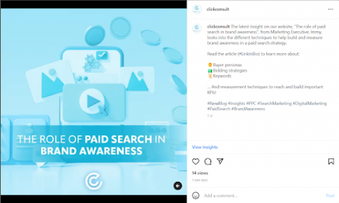
Take, for example, Click Consult’s branding. Consistent across the board, memorable and recognisable - including on SERPs, socials, websites and emails.
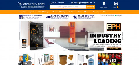
Another brand we work with, Nationwide Supplies, has a very clear brand throughout its website and social media.
Social Proof
Social proof is a theory built around three core principles including:
- Uncertainty
- Similarity
- Expertise
Social proof is a psychological belief – in this instance – that what we see others purchase will impact what we purchase. Part of being human is looking to others to evaluate the proper behaviour for a certain situation. 82% of Americans seek recommendations from friends and family before making a purchase, so having evidence of recommendations for your products is essential to convert prospects into customers.
New products and brands could mean purchasing anxiety* from your prospects, just having information about a product isn’t enough to influence a person into purchasing. By including social proof (through something like positive reviews) you could see online conversions increase by 113%.
*Purchasing anxiety; a psychological block that exists primarily because the customer does not know everything about the product or your business.
There are many ways to improve your ecommerce business through social proof, and include:
- Social Ads
- Homepage
- Community Pages
- Transactional & Promotional Emails
- Rating System
Consumers are six times more likely to purchase a product if the page includes pictures from social media. With websites such as TrustPilot, product pages can also include a star rating system from real buyers, with more than three-quarters of UK consumers (77%) regarding customer reviews as ‘very important’ or ‘important’.
Customers
Having an in-depth understanding of your customer, who they are, what they’re looking for etc., is essential to selling your product – whether this be on your website or through social media.
We recommend conducting research into buyer personas, and have written an article about building brand awareness that is relevant here. It doesn’t hurt to gain an understanding of what people who are purchasing your products/services are like, and why they might buy from you – the opposite is true, in fact.
Not doing your research could prove detrimental to your efforts.
Furthermore, having the right amount of detail for your customers on your product page is also an important consideration. The buyer’s journey in 2023 involves a lot of research into a brand and their products/services, with 58% of consumers saying they’ve discovered at least one new product by searching the internet. However, even with this data, don’t assume a prospective customer knows everything about you. Your product pages must contain information that caters to your current and prospective customers, try using features such as:
- Visual storytelling
- User experience features – drop down tabs, overlays etc.
- Product guides
- FAQs
Content
Your product pages should help your prospects solve a pain point and make their lives easier (and therefore the customer, happier). Have a think about how your content conveys your product’s ability to make their lives more fun, enjoyable or efficient – or a combination of the three! Make the customer wonder how they’ve gone through life without your product or service through aspirational content.
When speaking of content, it’s important to not overdo it and to find that perfect balance for your page. It’s also important to sound human, engaging and… not boring! Invest the time and energy into your content and you’ll see positive results.
Images
Building your online store comes with a few unique challenges, this is due to customers not being able to physically try products – through smell, taste, touch or even seeing them in real-life.
We have previously written a guide to ecommerce product imagery, where we include;
- Why product images are so important
- Types of imagery
- How to optimise imagery for your site
- Google Lens
Product photography makes up such a major part of your product page that it’s important not to underestimate the value of great imagery. Use high quality (and branded) images that can also be displayed on the first page of SERPs, but also making sure that the photographs reflect the product in the correct way. We recommend experimenting with angles, the lighting and the focus – this is your opportunity to design an experience that casts your product in the best light (literally).
In addition, ensure that your images link to your product variants, but also make sure that variants aren’t artfully named, a colour called “frosted midnight salmon” might confuse a customer. A simple “salmon”, or even “pink”, will do.
Call to actions (CTAs)
In the pursuit of conversions, don’t drown out the most important element – the call to action (CTA). According to Leighton Interactive the average click through rate (CTR) for button CTAs is 5.31%.
Buying a product should be easy, and if a page is overcrowded with irrelevant information, you’ll likely lose conversions. The CTA can be seen as the bridge between marketing and sales, and is an important part of the sales funnel.
A consistent answer to the question, “what makes an effective CTA?”, comes in three segments:
- Appeal – to the consumer’s needs
- Easy to find – make it stand out
- Guide – take the consumer on a journey that’s specific and action-driven
Result enhancements
Providing additional product information beyond the required properties could help your content receive additional visual enhancements on SERPS.
According to Google Search Central;
Enhancements are shown at the discretion of each experience, and may change over time.
Because of this, Google recommends to provide as much rich product information as available. Merchant listing experiences can be enhanced through:
- Ratings – While the Review type is used by merchant listing experiences, positive and negative notes (pros and cons) are not. Therefore no additional properties for reviews specific for products are listed here.
- Pros and Cons
- Shipping –Nested information about the shipping policies and options associated with an Offer. If you decide to add shipping Details, add the required and recommended OfferShippingDetails properties.
- Availability – The possible product availability options. The short names without the URL prefix are also supported (for example BackOrder).
- Price drops
SEO
The average click through rate for position one on SERPs is 39.2% with position two dropping down over 60%, at an average of 15.45%. The benefit of using SEO to boost conversions on your ecommerce site isn’t up for debate at this point.
The benefits of an SEO-friendly website include:
- Improved search engine ranking
- Enhanced user experience through providing value to potential customers and improve their overall experience
- Increased clicks and conversions
In regards to SEO, anything that matters to your content pages, matters to your product pages as well. We’ve covered a lot in this article but don’t forget the foundations of any SEO optimised page.
Final Thoughts
A poorly presented or unstructured product page can prove the difference between complete disinterest and buying. Moreover, you could frustrate customers with unclear results, losing you money and their trust.
I fully believe that going the extra mile, even through small changes can make a significant difference. Start with ideas and follow through with what’s right for your business.
